Project Overview
The logo for People First successfully encapsulates the brand’s mission of providing financial empowerment and accessibility to people who are economically marginalized in the USA. Through a thoughtful design process and careful consideration of the brand’s values, the final logo stands as a symbol of trust, inclusivity, and modernity, helping to establish a solid and memorable identity for People First in the fintech and consumer electronics markets.
Objective
Design a logo that embodies the values and mission of People First, a company dedicated to empowering the economically marginalized community in the USA through accessible financing for essential technology products.
Design Process
- Understanding the Brand
The first step in creating the logo for People First involved a deep dive into the company’s mission and values. People First aims to provide financial inclusivity and empowerment, allowing the Black and Brown community in the USA to purchase gadgets on credit. The Brand’s core values include trust, empowerment, accessibility, and community support.
- Concept Development:
The concept development phase included brainstorming sessions and sketching various ideas that could visually represent the brand’s mission. Critical elements considered were:

Inclusivity and Diversity: Reflecting the diverse community the company serves.
- Trust and Growth: Symbolizing the financial services’ supportive nature.
- Technology and Accessibility: Incorporating elements that indicate the focus of the growth.
Initial Sketches:
Several initial sketches were created to explore different directions. These sketches focused on integrating unity, technology, and financial empowerment symbols. Key motifs included:
- Arrows and Circles: Representing support, unity, and inclusivity.
- Abstract Symbols: Indicating Technology and Modernity.
- Letterforms: Using the initials “P” and “F” creatively to build a unique identity.
Refinement and Digital Rendering:
After reviewing the initial sketches, the most promising concepts were refined and digitized. The focus was creating a clean, modern, and versatile logo that could be easily recognized and reproduced across various media.
Final Logo Design
Primary Logo:
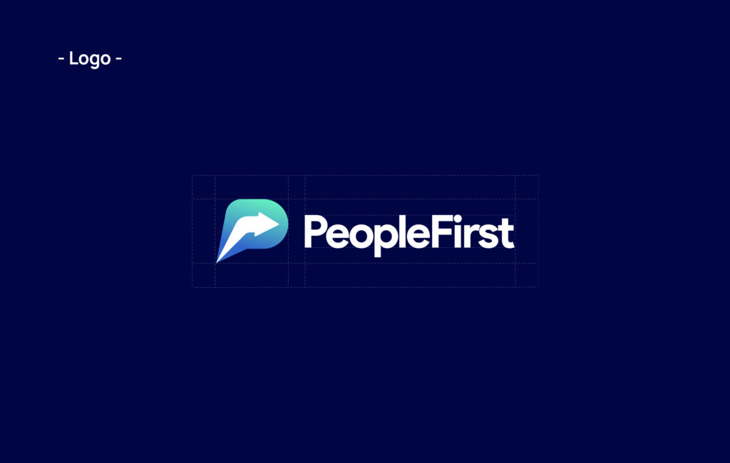
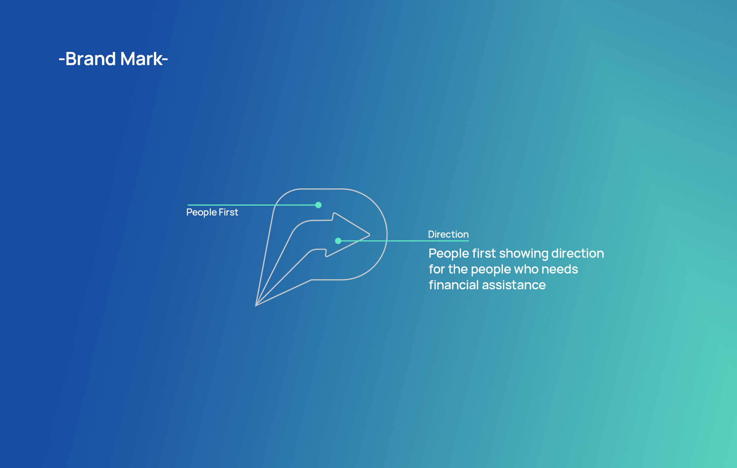
Description:
The final logo for People First features a sleek, modern design that combines unity and technology elements. A stylized “P” and “arrow” are interwoven to form a cohesive and dynamic symbol. The brand’s use of vibrant, inclusive colors (such as shades of blue and green) highlights its commitment to diversity and financial empowerment.
Color Palette:
- Primary Color: Blue, Symbolizing Trust, Reliability, and Technology.
- Secondary Color: Green, representing growth, prosperity, and financial wellness.
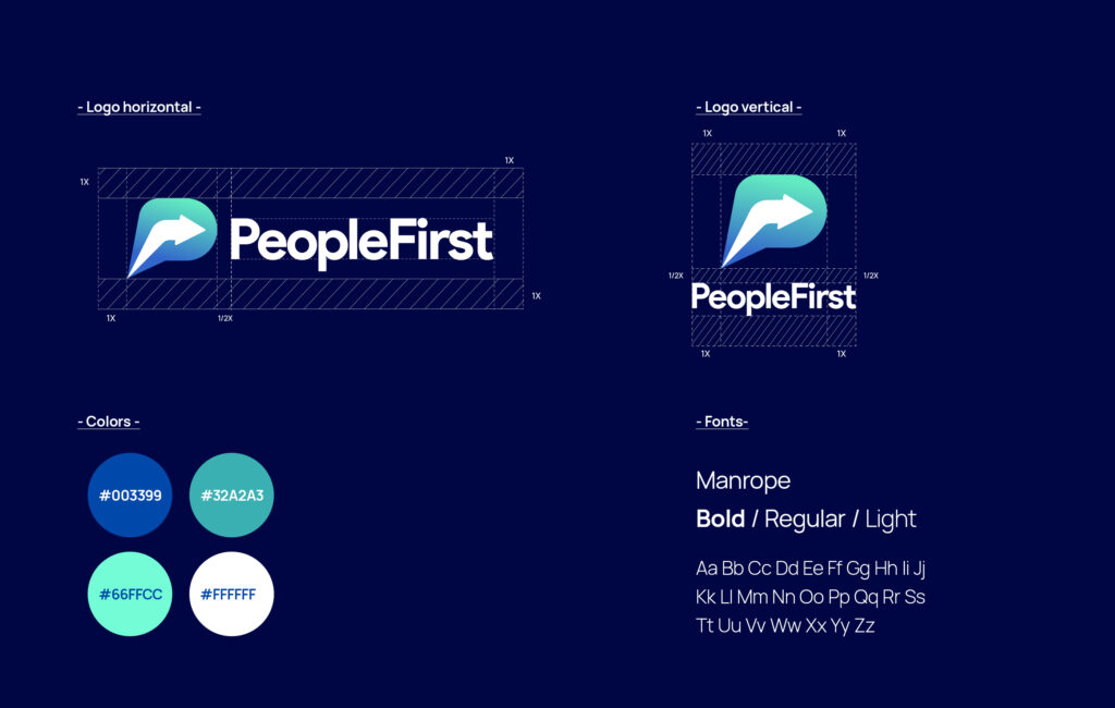
Typography:
The logo is complemented by a modern, sans-serif typeface that ensures readability and conveys a sense of forward-thinking and approachability. The typography is clean and bold, aligning with the brand’s solid and supportive nature.
Versatility:
The logo is designed to be versatile, working well in both digital and print formats. It can be used in various sizes, ensuring consistency and recognizability across different platforms, from mobile apps to marketing materials.
Application Examples
- Website and mobile app:
The logo is prominently displayed on the People First website and mobile app, providing a strong visual identity and reinforcing the brand’s commitment to empowering its users.
- Marketing Collateral:
The logo is featured on business cards, brochures, and social media graphics, creating a cohesive brand experience that communicates trust and accessibility.
- Product Packaging:
The logo is also used on product packaging and promotional materials, ensuring that every touchpoint with the customer reinforces the brand’s mission and values.