I have designed multiple Power BI applications in Cervello, primarily for fintech, insurance, and large data handling applications. Regarding user experience, Power BI dashboards differ slightly from dashboards designed for custom development because Power BI has limitations when it comes to design, and use cases are unique.
Design with the end-user in mind:
Fintech applications typically cater to three types of users:
- C-suite executives who require summarized reports.
- Executives who need to delve into the data.
- Consultants who take action based on the reports.
Understand the target audience and their needs. Ensure the visuals, layout, and interactions are intuitive and fulfill their requirements.
Focus on report performance:
Given the enormous volume of data we manage, we have optimized the data model and visual design to guarantee fast loading times and responsive interactions. We focus on presenting data that necessitates immediate action, allowing users to explore further if they require more information. Sluggish performance could discourage users from interacting with the dashboards.
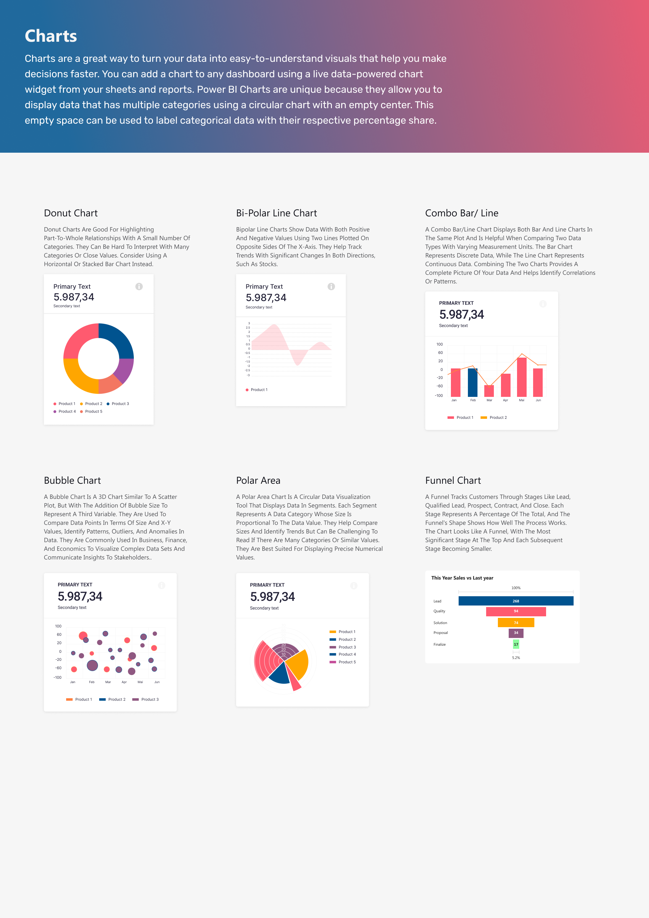
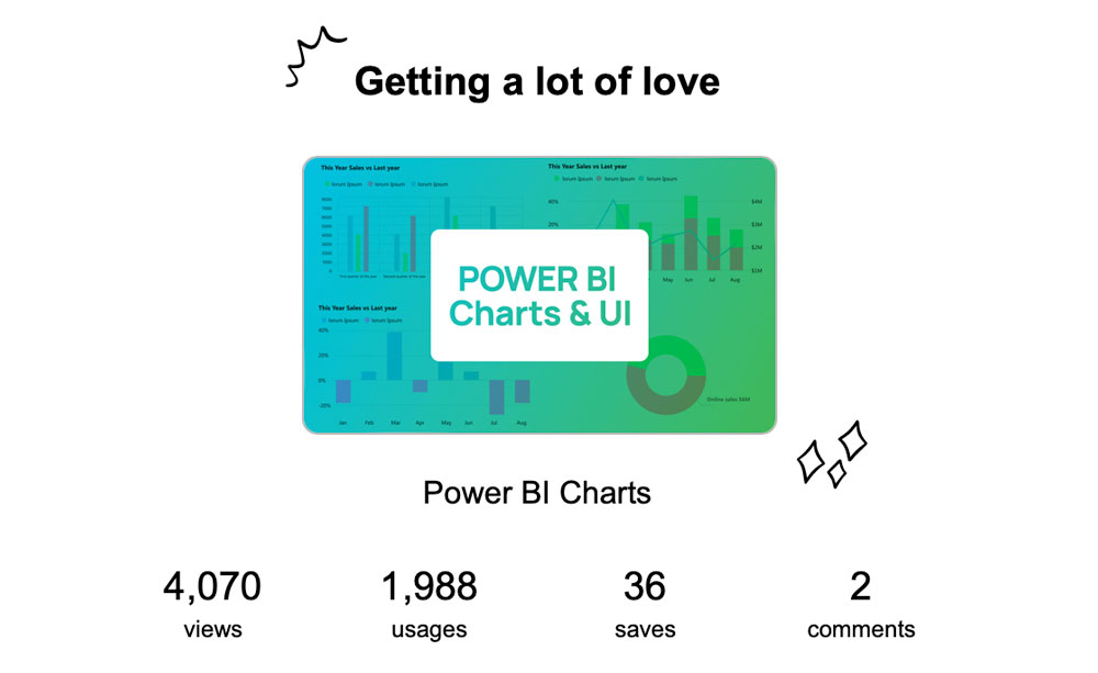
https://www.figma.com/design/GQZ8VqORhuwCzuleWi1bvL/Power-BI-Charts-(Community)
Involve users throughout the design and development process. Gather feedback and make incremental improvements based on their input. This will help align the dashboards with user needs. We have utilized Miro to sort requirements, collect stakeholder comments, and conduct reviews with developers. It’s an incredible tool.
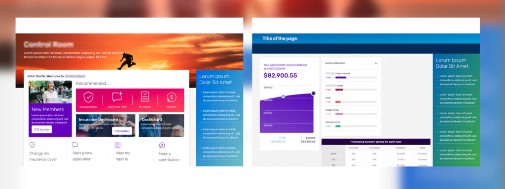
Intuitive Interface
The main goal of Power BI and Tableau dashboards is to display complex data in a clear and visually appealing way. A well-thought-out user experience ensures that the visualizations are optimized for easy understanding and insight generation. Power BI and Tableau strive to offer intuitive, user-friendly interfaces that make it easy for non-technical users to explore and analyze data. A well-designed user experience makes the dashboards more accessible and engaging for the intended audience.
Navigations, Filtering, and Metrics
Implement features like page navigation, filtering, and drill-down capabilities to enable users to explore the data and find insights efficiently. Track how users interact with the dashboards to identify areas for improvement and measure the impact of UX design changes over time. By prioritizing the end-user experience, organizations can drive broader adoption and generate more value from their business intelligence investments.
Actionable Insights:
Consultants and executives require dashboards that offer actionable items for improving targets. Dashboards are most valuable when they enable users to identify trends, patterns, and actionable insights quickly. An intuitive user experience (UX) design facilitates this process and empowers users to make data-driven decisions.
Competitive Advantage
In business intelligence, user experience (UX) quality can significantly set tools apart. Tableau and Power BI prioritize UX as a competitive advantage over other BI tools, highlighting the urgency and importance of this aspect in the industry. Prioritizing UX is not just a task but a strategic decision that ensures the dashboards meet the needs of the target users and maximize the value of the underlying data.